WHY IT’S GOOD TO FEEL BLUE
Taking a closer look at the color blue.
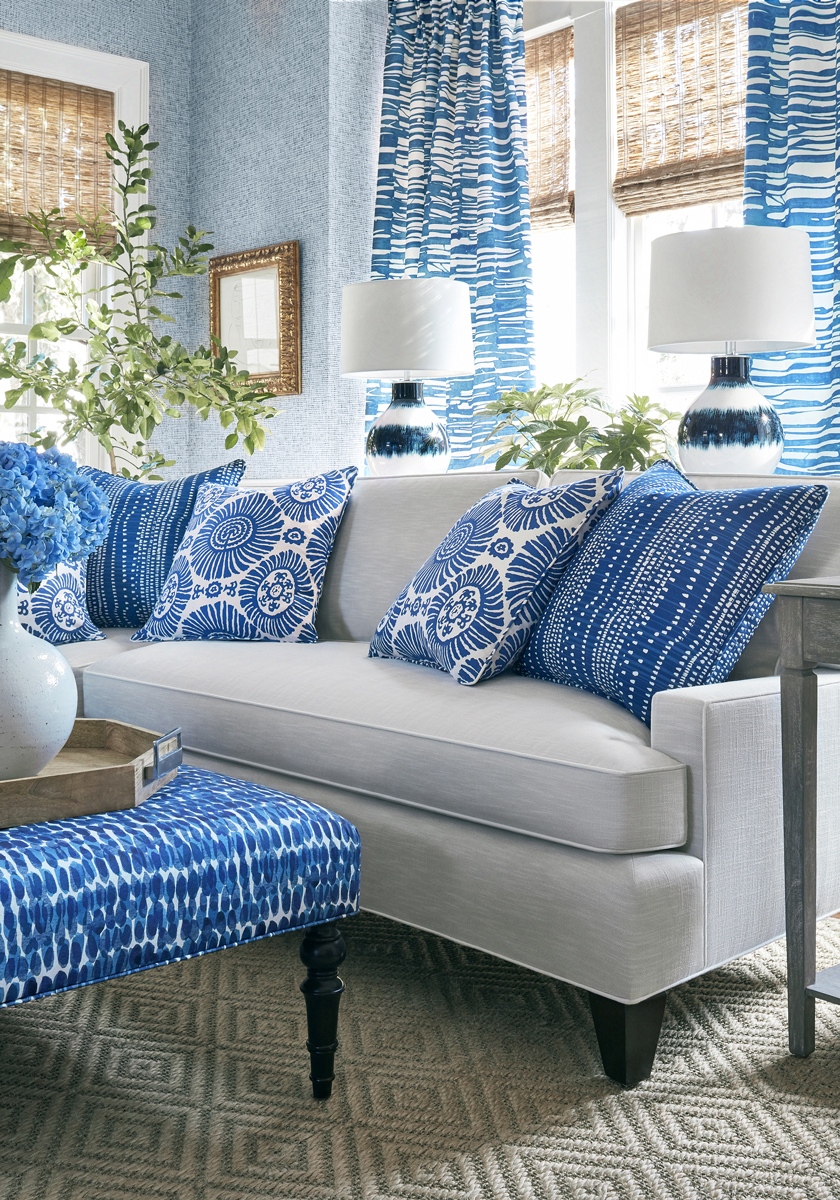
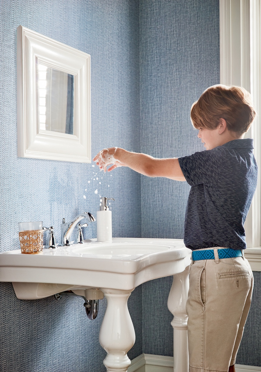
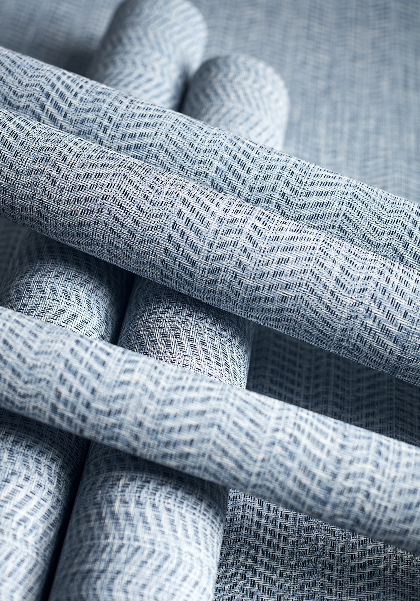
Blue is the world’s favorite color. Time and again in opinion polls, it emerges as our most popular shade. That said, blue can be a hard color to get right when it comes to interior design. Too pale and it can appear cold, too bright and it doesn’t work in our northern hemisphere. But when you find the right shade, blue is calming and relaxing, warm and soothing. It’s also surprisingly versatile as it’s friends with most of the other colors on the spectrum. That means you can integrate it into the overall color palette of your home without too much difficulty.
COOL. CALM. COLLECTED.
The goodness of the color blue.
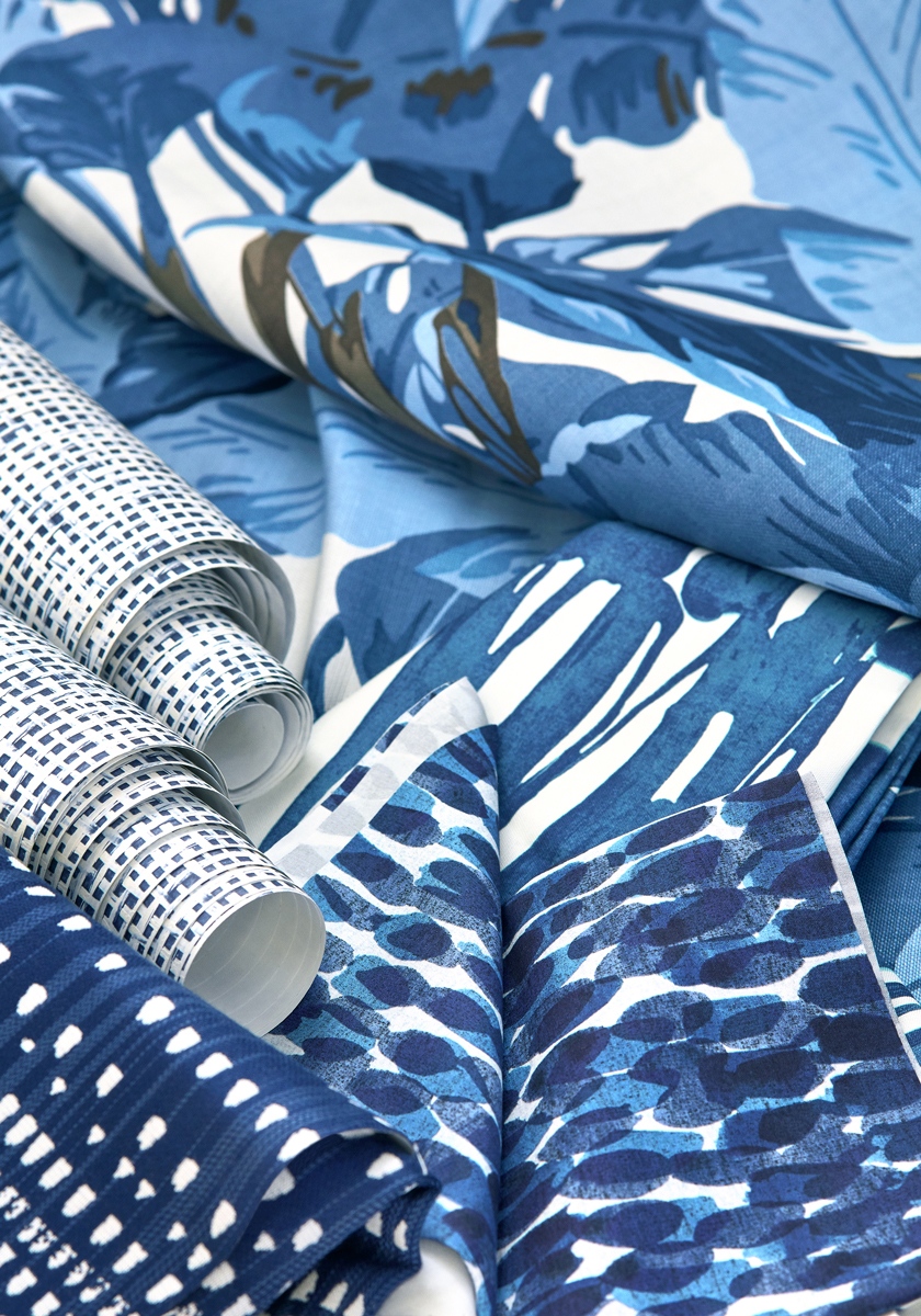
Blue is calming. Blue is linked to creativity and intelligence. Blue is said to make us feel safe, serene, secure. We love using the color blue in every season and in every room. It’s a color that is so rich and deep that it will make your heart sing every time you see it. From furniture to wallpaper, glassware to tables, it’s everywhere in every hue. Pick the tone you like and mix up the shades.
To start planning colors and furniture design for the home you’ve always wanted, arrange a free design consultation at The Quiet Moose.